Case study
Research and design
SIRS reporting form
Helping aged-care providers give the regulator the information it needs, within a 24-hour deadline.
- My role
- UX/UI Designer
- Client
- Australian Government Department of Health, with the Aged Care Quality and Safety Commission
- Completed at
- Folk
Context and challenge
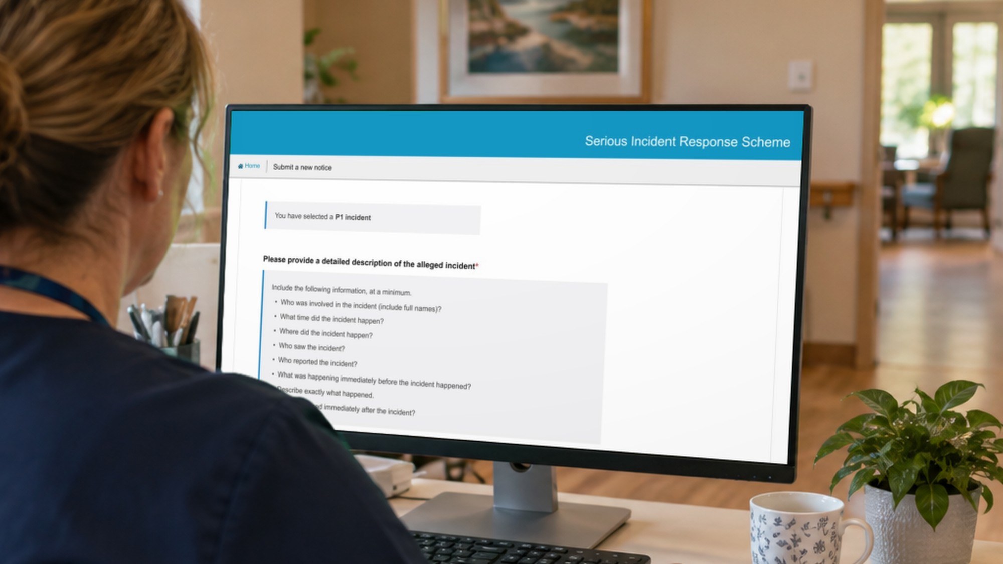
The Serious Incident Response Scheme (SIRS) is how aged-care providers report serious incidents to the Aged Care Quality and Safety Commission. Reports often arrived too thin to act on, so case managers spent time chasing providers for missing details. As one put it in research, if they had received the information they needed, they could have closed the case.
The Department of Health asked Folk to improve the SIRS form in the My Aged Care provider portal, within the existing .NET platform and about nine weeks. The people using it ranged from nurses reporting on the floor to senior managers reviewing reports, plus home care providers about to start reporting.
Our lead researcher led the approach, and I owned the prototype: after each round of testing, I turned the findings into design changes and built the version we tested next.
Hearing from both sides of the report
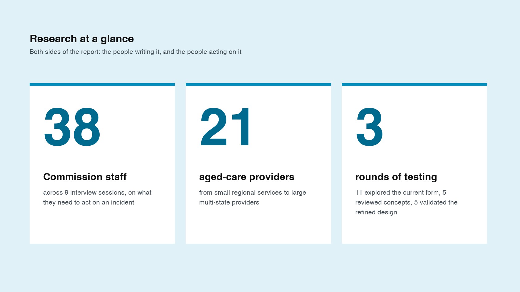
We ran 9 interview sessions with 38 Commission staff to understand what information they need to act on an incident. We then tested with 21 providers across three rounds: 11 exploring the current form, 5 reviewing our concepts, and 5 validating the refined design and new help text from the Commission. Participants ranged from small regional services to large multi-state providers.
The form wasn’t the problem
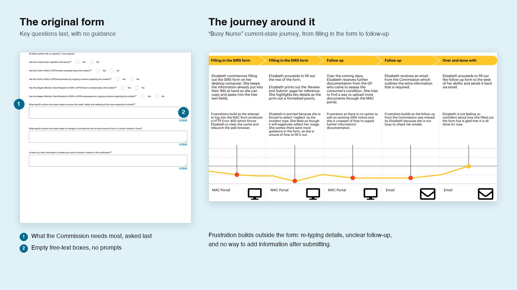
Most providers found the form itself straightforward. The friction sat around it: clinical and police details often didn’t exist within 24 hours, staff re-typed information from other systems, and many didn’t know they had five days to add more. Inside the form, the questions the Commission cared about most came last, with no guidance, so answers were thin. That shifted the brief from “simplify the form” to “help people give the right information at the right time”.
Designing guidance where decisions happen
Showing what a good answer looks like
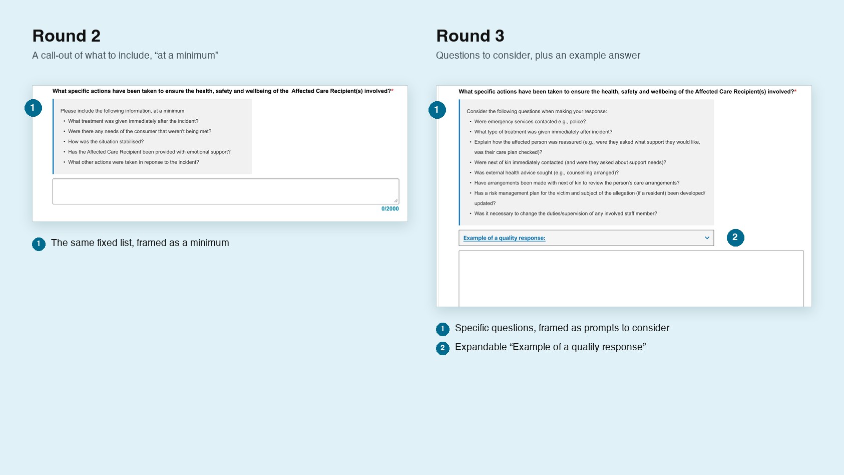
Staff didn’t know what the Commission wanted from free-text fields, so answers were often a line or two. In round 2, I added prompts beside the key fields, but providers pushed back on the “at a minimum” framing and asked for prompts that fit the incident type. For round 3, I reworked them into specific questions to consider, with an expandable example of a quality response. All five final-round providers said the prompts would help, and flagged the text boxes as too small, which became a recommendation.
Helping staff decide what to report
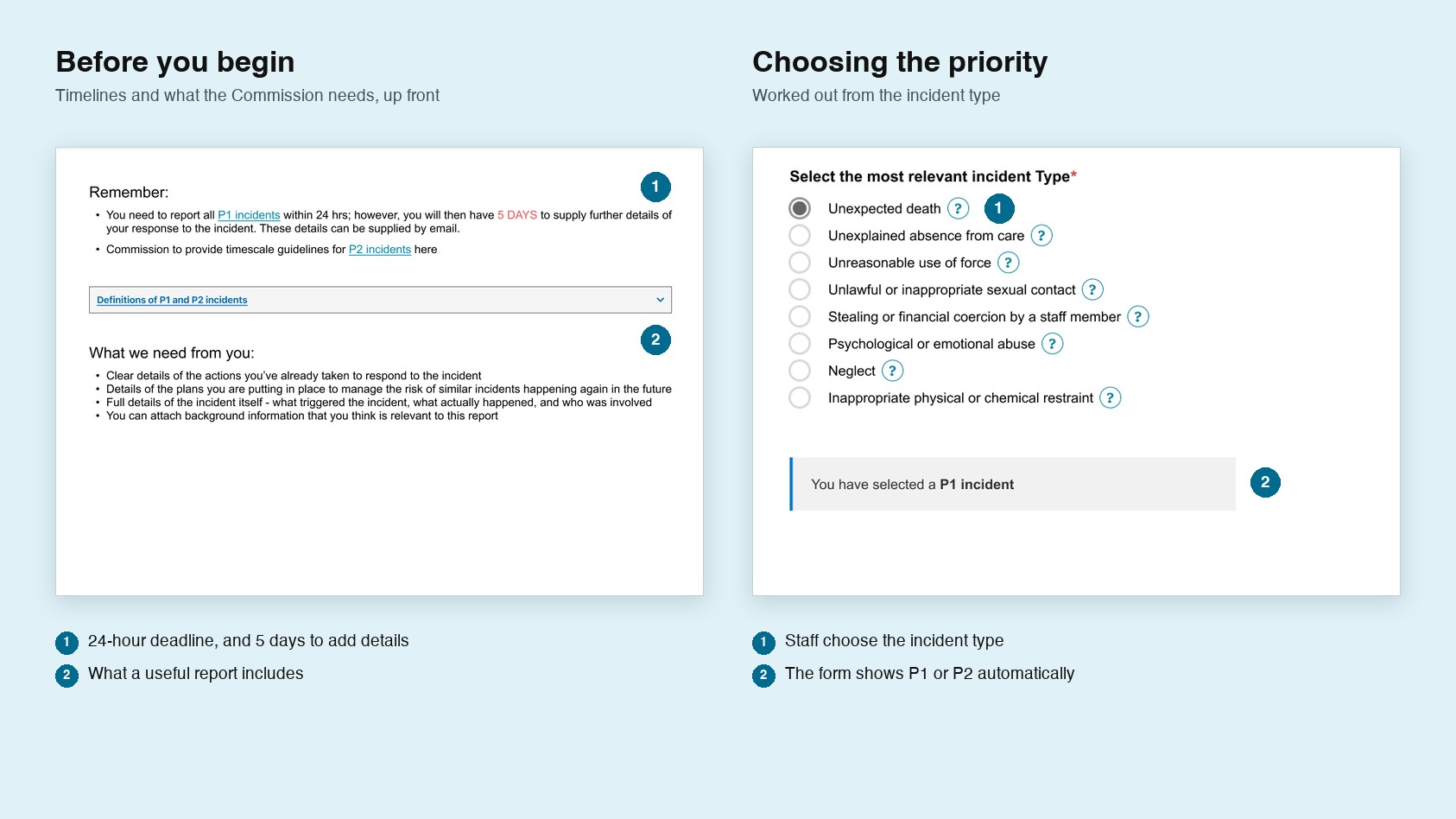
Staff were often unsure whether an incident was reportable, or whether it was priority 1 or 2, and many didn’t know about the five-day window to add details. I designed a “Before you begin” screen covering timelines and what the Commission needs, and moved the priority after the incident type, so the form shows P1 or P2 automatically. All five final-round providers found the screen helpful, and the priority concept tested well.
Making sure follow-up requests reach someone
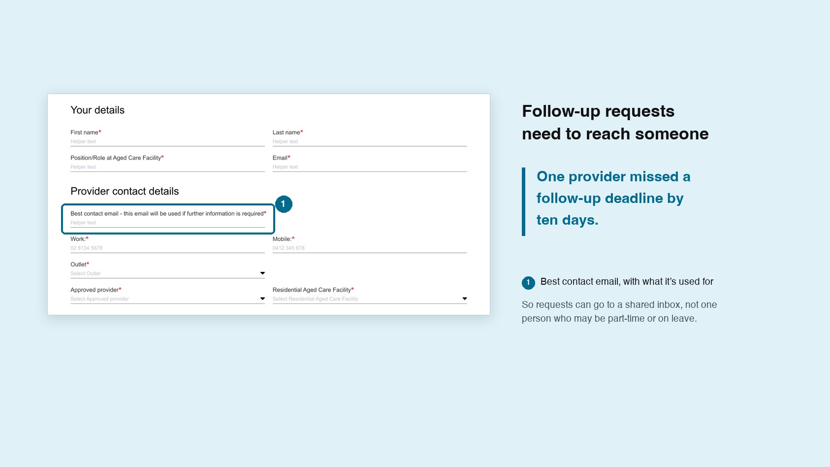
Requests for more information went to whoever submitted the report, so with part-time staff and supervisors on leave, deadlines were missed. One provider missed theirs by ten days. I added clearer messaging about the best contact email, so requests can reach a shared inbox: designed for how aged care is actually staffed, not for one person who is always available.
Handover and recommendations
I packaged the final design files for handover, alongside the refined prototype, personas, current-state journeys and a final research report. The recommendations had two horizons.
Quick wins for the current form: the changes above, larger free-text fields, a clearer review-and-submit screen for managers checking reports on their phones out of hours, and allowing a single incident of neglect, rather than a minimum of one month. We also recommended replacing “neglect” with a less judgemental term, after providers described it as damaging to staff morale and a deterrent to reporting.
A longer-term service vision: letting providers add information after submitting and track their cases, aligning with NDIS reporting to end double-handling, and eventually connecting providers’ own incident systems directly to SIRS.
Outcome and reflection
The project ended at a tested design and a set of recommendations ready for the Department’s build team. I don’t know which changes were implemented. Across three rounds, the evidence was consistent: providers said the guidance would help them give the Commission better information.
For me, SIRS showed that in a regulatory form, the words are the interface. The biggest improvements came from prompts, examples and labels, placed at the moment someone needs them.