Case study
Employee experience
Compass intranet
Turning an intranet MVP into templates staff can rely on and editors can keep consistent.
- My role
- UX/UI Designer (UX lead)
- Client
- NSW Department of Planning and Environment
- Completed at
- Folk
Context and challenge
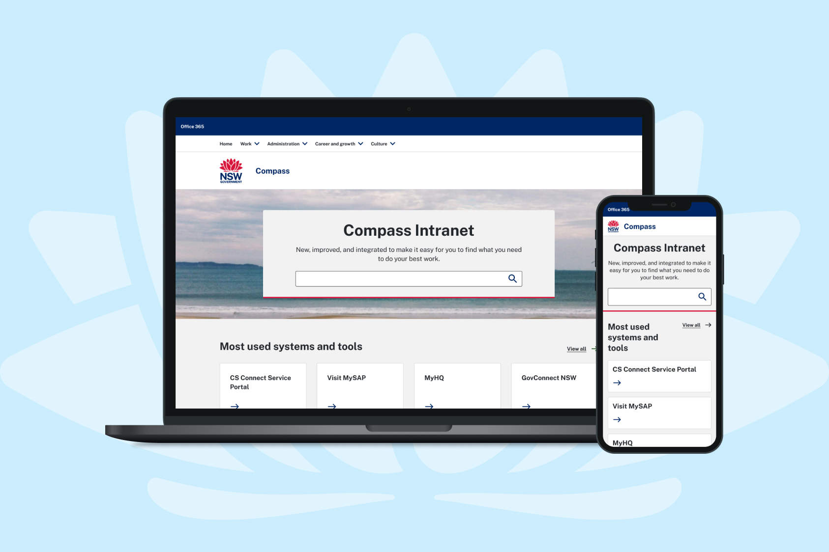
Compass is the intranet NSW Department of Planning and Environment (DPE) staff use to find policies, forms, systems and news.
Compass launched in 2022 as an MVP, with its structure and content rules in place but no page templates to apply them. Labels used internal system names, staff leaned on search and found it frustrating, and with teams across the department publishing, nothing kept pages consistent.
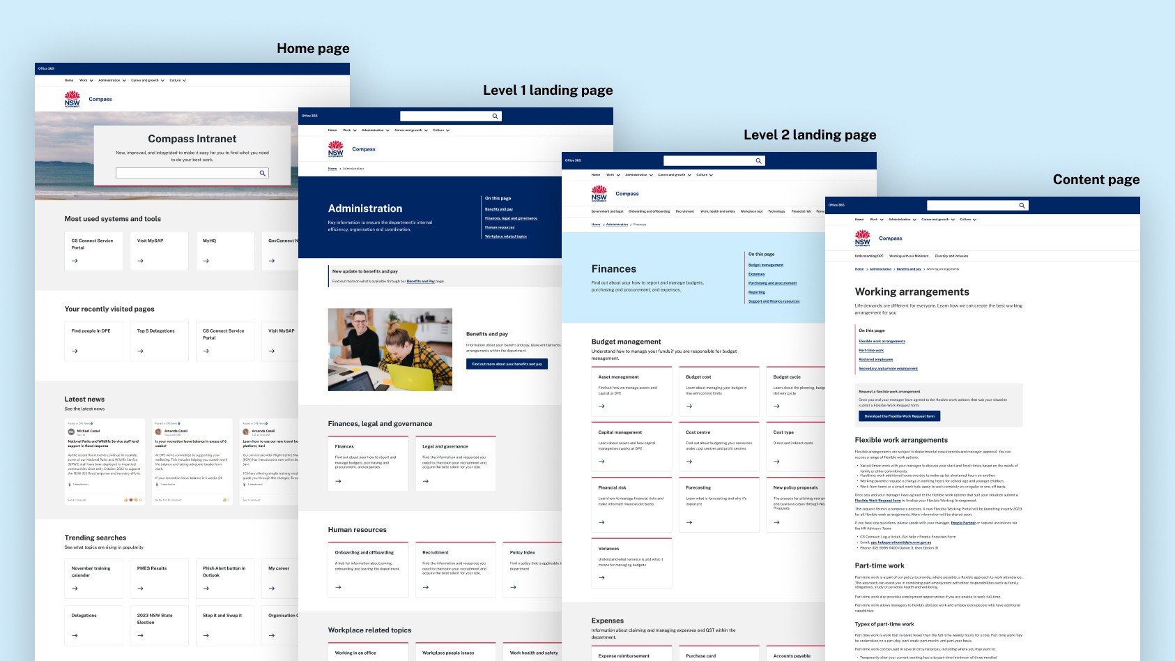
Phase 2 was to redesign the key templates for desktop and mobile, using SharePoint’s out-of-the-box components.
I led the UX, from templates and prototypes to testing and handover, supported by a lead product designer and advised by DPE’s SharePoint lead.
Simplifying the structure before designing it
A review of the Phase 1 research and the live intranet showed Level 3 landing pages added clicks without adding value. We removed them and folded their content into Level 2.
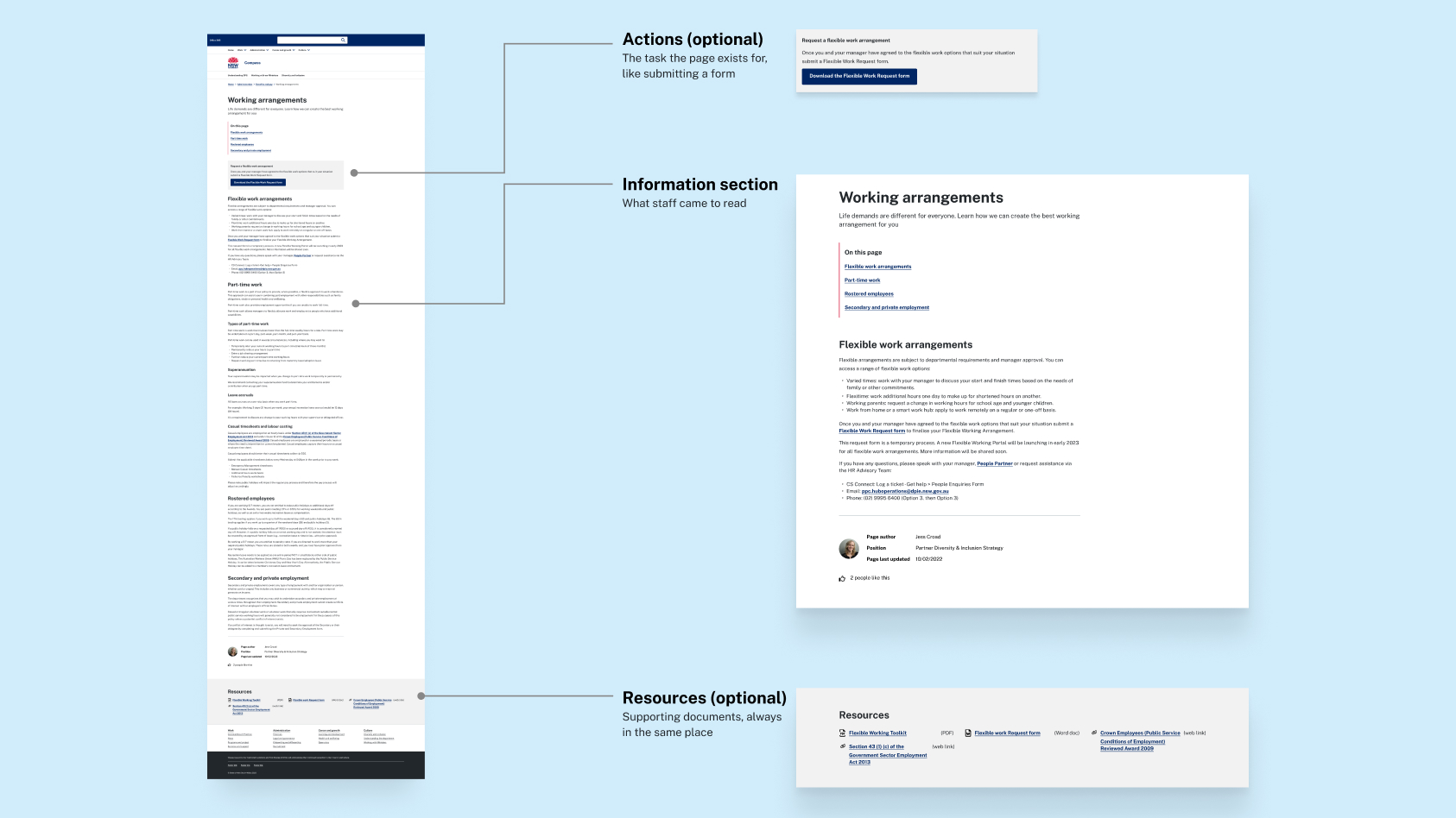
Walking through the live intranet with DPE, we saw that content pages did one of three jobs: explain something, point to documents, or help staff complete a task, like submitting a form. So I designed one content page template. Information is always there, and editors switch on an action block or a resources block when the page needs one. Staff get the same shape on every page, and editors get one pattern to follow.
Testing in four smaller rounds instead of two
The plan allowed for two rounds of testing. At the start, I proposed splitting them into four smaller rounds. Large rounds tend to repeat the same findings after the first few sessions, and smaller rounds would let us refine the designs between each.
I planned and facilitated two moderated rounds with 8 staff, from new starters to senior managers. Two unmoderated rounds in Maze followed with 16 more, four more than planned. Tasks included finding the procurement procedure and the Flexible Work Request form, and ranking homepage features.
What testing changed
Most of the testing confirmed the direction: staff found the new templates easy to scan, and clearly preferred the NSW Design System to SharePoint’s standard interface. The changes below came from where testing, or the people building it, pointed somewhere different.
Keeping the main action visible on mobile
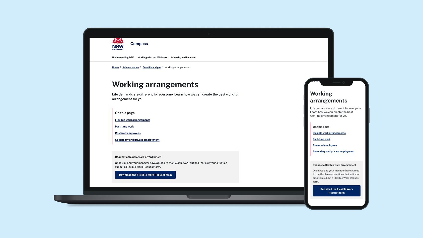
Staff preferred the actions panel at the top right of content pages. But a check with the developers showed that on mobile it would drop to the bottom of the page. I redesigned it as a call-out directly under the in-page navigation, so the main task is visible straight away on every screen.
Plainer labels, and page details people trust
“Supporting resources” and “Related resources” confused people, so they became one “Resources” label, in the same place on every page. Page details, including the author, their photo and the last-updated date, moved to the bottom. At the top they pushed content down, but staff still wanted them, because they’re less likely to trust a page that looks out of date.
Letting staff set the homepage priorities
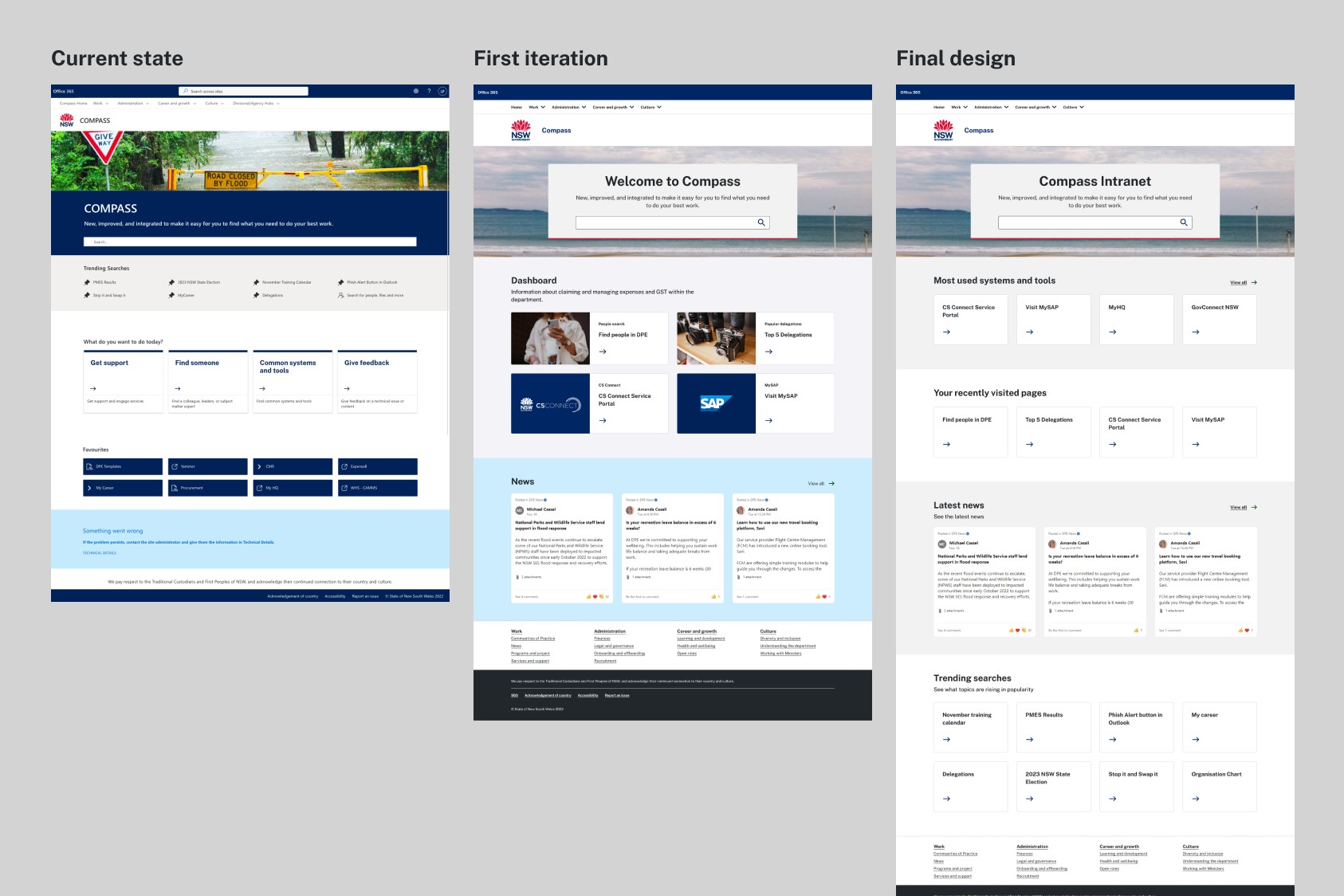
The homepage had more candidate features than space, so staff ranked them. Search came first, then most-used systems and tools, then recently visited pages, and the homepage follows that order.
Handover and recommendations
I handed over desktop and mobile designs and clickable Figma prototypes, along with a findings playback to DPE. Testing also pointed to issues beyond the templates, so the playback included five recommendations for what to tackle next:
- —Improve search. Analytics, testing and an earlier staff survey all showed search was the most used feature and the most frustrating. Fixing it could be a project of its own.
- —Review labels and content groupings. Staff looking for procurement struggled because the section used an internal system name, “OneProcure”. Labels should use the words staff actually search for.
- —Make key templates easier to reach. Staff regularly look for the same document templates, so they should be quicker to find.
- —Build in personalisation. It was part of the original vision for Compass, and staff still expected it. The homepage is the natural place to start.
- —Explain the change at launch. When I walked participants through the reasoning behind the content page template, they became much more supportive. A short video could do the same for all staff.
Outcome and reflection
The project ended at tested, platform-ready designs, and I don’t know whether they launched. DPE got templates built for its platform, tested with 24 staff, and a clear list of what to improve next.
Compass reminded me that an intranet has two sets of users: the staff reading it and the teams publishing to it. A template only works if it’s simple enough for both.